
Question:
I noticed a Metrics tab in the Diagnostics tool in Power UX. What do the colorful bars in Request Response Time mean?
Answer:
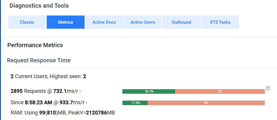
The pair of bars together give some indication of the distribution of response time to requests to the Spitfire web application. The bars show, by color-coded percentages, how well the system is running. To really know how your system is doing, you need to look at the whole picture: total number of requests, average response time and the distribution.
The information to the left of the bars gives you more exact information.
- The first bar represents the average performance for the entire day based on the number of requests since your server was started along with the millisecond per request speed.
Wait until there have been at least 1000 requests before paying any heed to the percentage. Optimal percentages are over 85% green (not 36.9% as shown above). - The second bar represents the average performance for the most recent 100 requests–often covering just a minute or two. This allows you to see if recent performance is better or worse than the overall daily performance.
Together, the bars give you idea of the performance (no time lag vs. a small or large time lag) being experienced by your users.
Bar Color:
The bars have from 1 to 3 colors as in this second example:
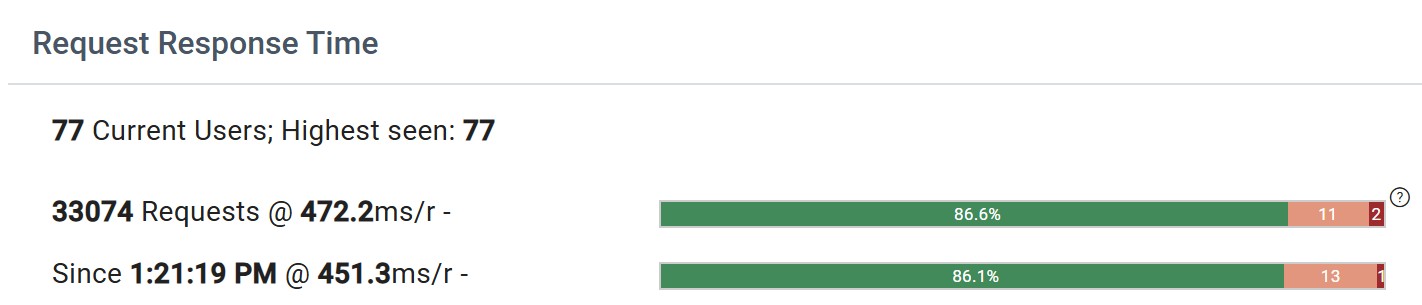
- Green should be the largest section, hopefully over 85%. The number inside this section is the percentage of requests that were satisfied at or under 1 second.
- Rose indicates the percentage of requests that were satisfied within 1 to 3 seconds
- Red should be very small (only 2 or 3 percent at most). This indicates the percentage of requests that required more than 3 seconds.
Why is there a red section at all? Most tasks are trivial; others task take time, such as approving an owner change order or opening a budget revision. It is natural for the work required by these outlying requests to take a bit longer. Generally, users are willing to wait for these to complete as long as average response time remains snappy.
Average Response Time:
Now that we have some basic understanding of the response bar we can factor in the response time.
Fun fact: In order to prevent the data from being skewed, truly trivial requests that take under 20ms are not counted at all! These do not bring down the average response time.
Note how the 2nd example with 77 users and over 33,000 requests shows two such similar response times and bars!
It is helpful to know that industry standards and decades of research into human nature have indicated that people do not perceive anything under half a second. This is a 500ms response time. If users are waiting more than 1 second too often, things are “slow”. If forced to wait more than 3 seconds humans get irked.
- If the average response time is less than 300, then you can rest happy and know that your users are spoiled rotten.
- If the average response time is under 500, the red responses might be irritating for your users, but general flow is good.
- If the average response time is between 500 and 700, things are getting edgy.
- If the average response time is over 700, your users are probably unhappy.
Higher average response times combined with higher rose and red percentages are bad. There aren’t enough really fast responses.
Out of Balance:
If your average response time is decent, perhaps around 400, but your rose and red percentages are high, this indicates a resource issue. Most likely, there is not enough RAM for caching, or there are not enough cores available. A bottleneck is getting in the way.
Additional Details:
The metrics pages also offers details on performance for Workflow Scripts, REST API endpoints and SQL Commands. It can be helpful to scan these details looking for outliers, particularly ones that are 2x the average response time or more. These resources may be contributing to bottlenecks.
KBA-01872; Last updated: July 16, 2025 at 8:41 am