Request: Some fields on a document tab are closely related but not physically close to each other. Is there a way to make them appear closer so they seem to be more connected?
Yes! You can use an option in the UI Configuration tool to move a second field closer to the first if they are on the same row.
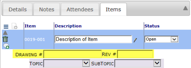
For example, the Items tab can display the following fields:
 You might want the Rev # field to be right next to the Drawing # or the SubTopic field to be right next to the Topic field, so they are better seen as a unit.
To make the second field stay close to the first field on the row:
- Go to the UI Configuration tool on the System Admin Dashboard.
- Select the appropriate Doc type (Meeting Minutes in our example) and Part (Doc Item Detail- Standard in our example).
- Select the first of the two fields that you want to keep together, for example Drawing Number.
- Edit the row and in the Extended field, type CSS=sfTDMergeNext.
- Accept your change.
- Repeat as needed.
- Remember to save.

After this configuration, the second field on the row on the document will be displayed right next to the first row, for example:
 Notes
Notes
For more information about Extended options for the UI Configuration tool, see KBA-01336.
For more information about the UI Configuration tool, see the Focus on System Administration guide.
